
I was recently commissioned to create a header for The Tea Spot
Some of you will remember them from providing a fabulous prize
for the giveaway I ran to relaunch the Cuppa With Friends Project late last year
and they were a joy to work with, so when they approached me about creating a header for both their facebook page and twitter feed, I jumped at the chance.
I loved how it came together in the end and it was great to revisit a more complex style of work again, as I haven't worked in this style for quite some time.
So as I get quite a few emails asking me about how I paint in the style of my blog header
I thought it would be the perfect opportunity to share a bit of process with you...
of course once I started writing it took on epic proportions as I got the chatters a bit so I am spreading it across two posts with the second part going up next Tuesday...

So... the whole process started with me going back and revisiting some of the paintings I had done for The Tea Spot previously. I had created a couple of different versions, and was pretty familiar with the stepping mug that was to be included in the design as well as the logo, which for me is always challenging as my handwriting resembles something created by a chicken on acid, so anything font related leads to mild hyperventilation. But I felt pretty comfortable with the shapes after the previous practice so it was a pretty good start. I was sent a list of inclusions of what they would like to see in there, and that they would like it in the style of the header I use here on the blog, but outside of that I had free reign, which is pretty awesome, but at the same time was mildly nausea inducing as there aren't the parameters and things, and my problem is never finding a single idea, but rather culling the five squillion that bombard my brain. Added in there was the teas themselves as they had generously sent me a heap to try, plus lots of ephemera from around the office, so at the beginning I was facing complete overload when it came to inspiration.

The only way to settle the riot of flitting images in my head is to get a few quick sketches down, and while I didn't feel I needed to resketch the Steeping Mug, I did, however need to do at least a quick sketch of the Tuffy steeper, and this little collapsible sucker was a bit of a mind bender with all its rings and levels, and the little holder thing has a bit of a duck face happening, but at this stage I am just getting a sense of the shapes and lines. I also like to list some words that I think will capture the style and mood of it all, and yes this sounds a bit hippy dippy, but it helps to focus my brain. I knew I wanted to highlight the freshness and clean flavours of the teas, the energy of the company, and staff, and to ensure that I reflected their generosity, commitment and support for cancer charities, which of course is very important to me after the last 18 months.

From this starting point I worked on creating a single page which would be the master for the design on an A2 size piece of paper. I like to have quite a large sheet so that I have room to have all the notes in one place, because I know myself well enough to know that multiple pieces of paper in my studio have a way of disappearing quicker than a mob informer into a witness protection program, so a single master sheet is the best solution. At the top of the page I usually make notes of any inclusions that have to be there, and then I worked out which tea tins I wanted to include, so they would reflect the range but still work together and reflect the mood I was going for. I actually love one of the teas called Meditative Mind, but its dusky pink lid wouldn't have sat as well with the mood, so I stuck with the blues, purples, and green tins, and added the pop of orange from the Mango Tango to add a counterpoint and a bit of interest, and I do love a blue and orange combo more than any other colour combination... blorange just makes me happy....


Once the inclusions and things are sorted at the top of the page, I usually go to the bottom and work across with some thumbnails of some placements and composition. I know what I want to put in there, so it is a matter of working out how they can fit together in a pleasing way without creating a star of the show if you know what I mean. I also needed to consider that both headers have different dimensions, so I needed the final piece to be able to be cropped and still look complete, while the full one needed to not look like it had a bit tacked on. I also gave a bit of a try to including some pinks, but it was pretty clear that colour wise it didn't look as fresh, so I went back to the blues, greens and orange. Making compositional decisions via thumbnails at this stage makes a big difference. Varying directions, shapes, sizes and colours can be challenging, and you can't always rely on a background to bring it together, and the varying sizes of the two headers made it impossible to run a frame inside it to pull things together, so overlapping is the best solution as it means unity and creates a rhythm to the whole thing... on a good day... on a bad day it looks like someone threw up a whole heap of ideas onto the page... but I had a direction and it was time to dive in.
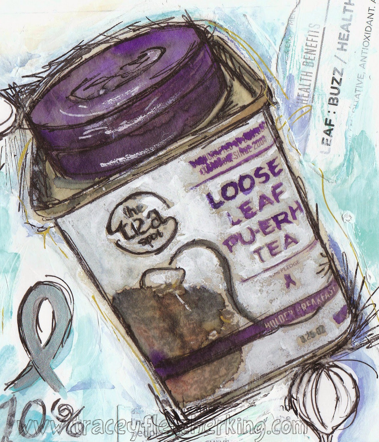
I drew up the dimensions across another A3 piece of paper and made sure it was all centred on the page as I was going to paint beyond the edges and then crop it back later, but I was then completely frozen. It looked pretty large and I hadn't exactly hammered down the composition, so I chickened out and painted up this purple tin first. I had decided I wanted to use varied textures so this was the perfect way to dip my toes in before stuffing up the final piece. I find it quite hard to draw onto handmade paper with pencil as my dodgy eyesight makes it hard to see, so it has to be pen and I didn't want to start badly and was feeling uncharacteristically nervous about the whole thing, so I actually pulled out and dusted off the lightbox. Once the sneezing and wheezing bought on from the dust cloud that emerged from the poor thing settled, I drew up the outline of the tin and quite frankly I spent way too long using different pens and colours, not to mention I even pulled out a magnifying glass to attempt to create the font and things, and in the end I just gave up on trying to make it too perfect and got some paint on it. It really does help to get the perfectionist bit out of the way early, and by working on something that will bleed and splodge a bit like you find with handmade paper, even when you are using using acrylic paint like I did with this one, it gets me into the mind set of letting things happen and to be loose and more accepting... to let my natural style come through
So the hardest part, which is the narrowing focus, planning and first painting was behind me, and the first tin had turned out well once I got a bit of paint on there covering up some of the stiffness of the initial drawing, so I was feeling ready to dive in... which I will cover in Tuesday's post... I think you all deserve the chance to go and have a bit of a break and a cuppa if you have made it to the end of such a long post ...
happy painting all... xx