On Friday I finished up part 1 having just finished painting up the first tea tin for the header commissisoned by The Tea Spot... I was bravely saying that I was ready to dive in, and I sort of did, but I dove in with pencil first. I sometimes like to draw in ink immediately, but other times I use a few quick pencil marks to make sure I have the proportions right, and other times I will draw it all in in pencil as I have done with this one. One of my pet peeves is the idea that using pen and only pen is the sign of superior skill... that is a big old crock of rubbish... sometimes it is more suitable to use pencil, and others you might use ink... who cares... anyway... I used some of the ephemera that The Tea Spot had sent and pasted it down on the paper first, taking are that you don't go right out to the edges with the glue,because one little bit squeezing out onto the paper is kind of diabolical watercolour wise. I also used a Tea Spot sticker for the logo so it would be really neat, though I painted a little gouache onto it so it would accept paint and pen down the track.

I extended the drawings beyond the border at the top and sides as I want the flexibility of moving the dimensions a bit. There is nothing worse than painting in a bit that looks fabulous and then you have to cut the bloody thing off... so I like to give myself options which means the next step was to remove the lines for the border and just check it is all where I want it. I have found the more time spent at this stage making sure I am happy saves a lot of heartache down the track. I was mostly happy, though I was a bit concerned with the white space between the steeping mug and the logo, but I figured I could sort that as I went along. I had purposely put the logo off centre to create a bit more interest and I knew the mug was going to be dark blue, so I needed to leave a bit of space to balance it all with the extra weight the dark blue would bring and it looked ok on the roughly painted sketch on my planning sheet so I decided to just trust it and go with the flow.
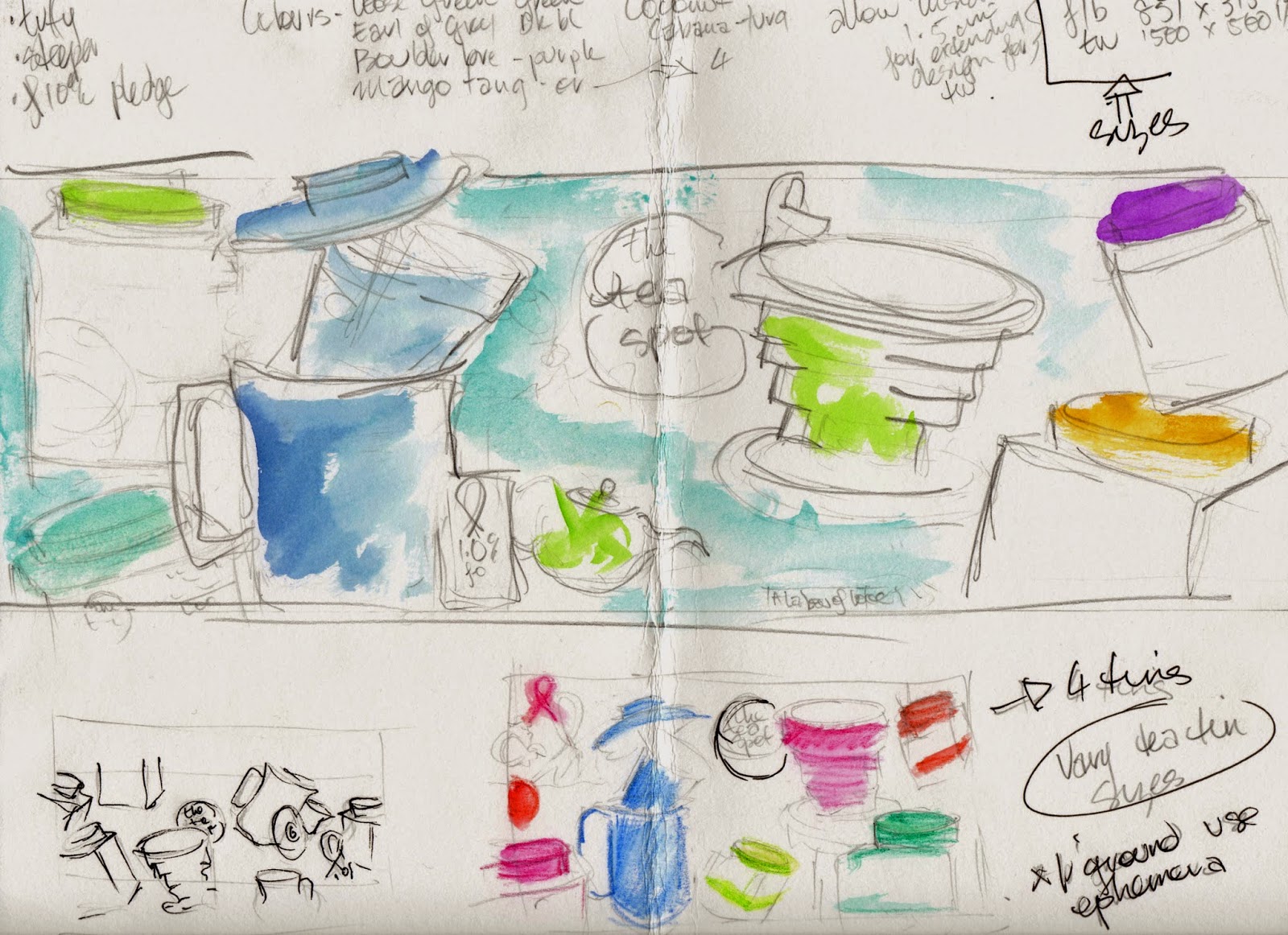
The final step before painting is always to take a photo of it. I find that when I see it on the computer I always spot the mistakes more clearly. Something about it being up on the screen makes problem areas more obvious. I also often go and look at it in a mirror if I want a quick check... anything to get fresh eyes on it. I also make sure I have jotted the colours directly on the piece so I don't mix them up. I work in very light pencil and only erase them as I paint in each. I really am that easily distracted that I would happily pick up the purple lid and do it again unless I keep on top of myself.... seriously ... I have done it too many times to not give myself the extra reminder. These aren't always set in stone, and I can adjust it after I paint some in if it feels a bit heavy colour wise in one area, but better to have the reminder than make a mistake and have to start again.

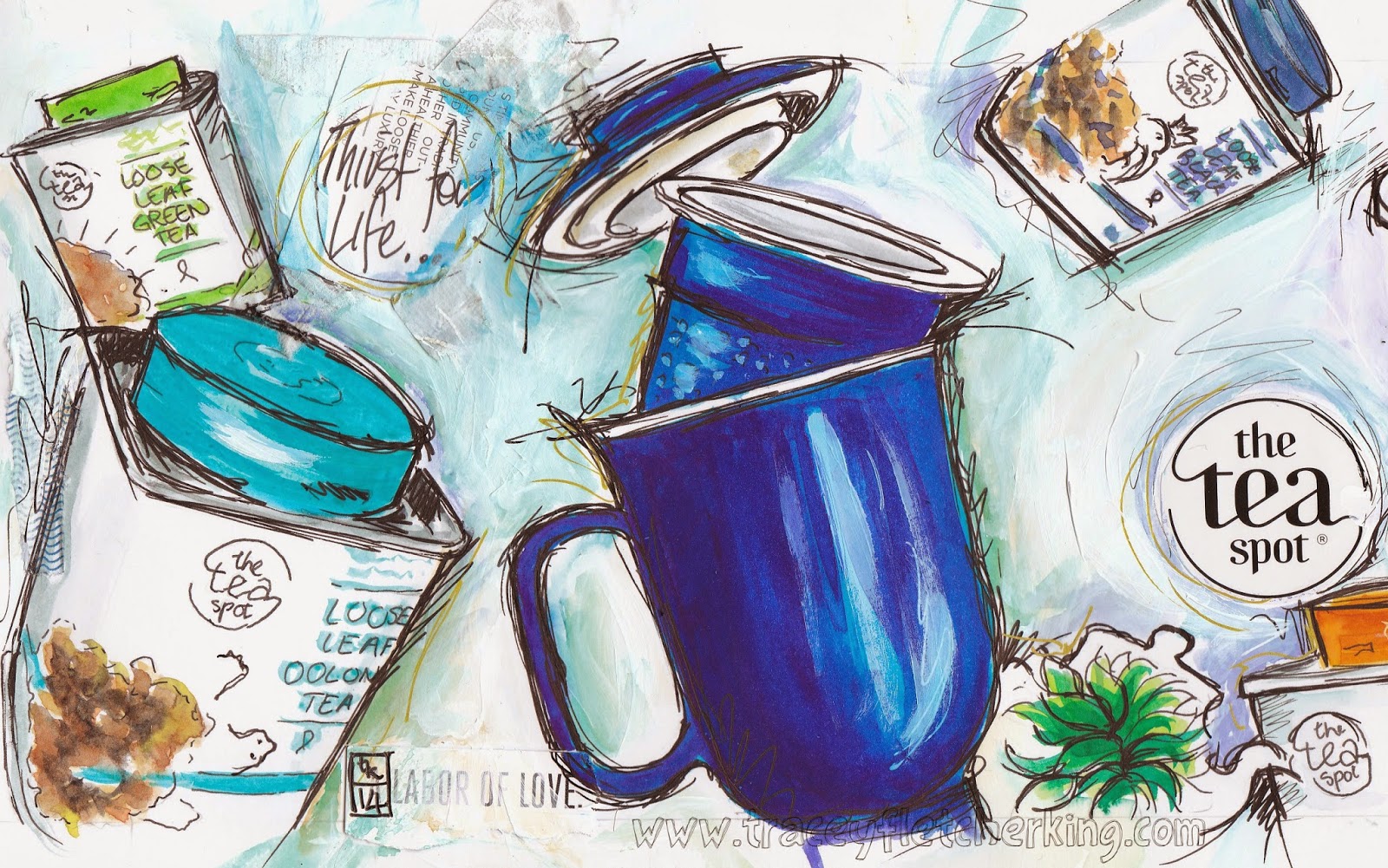
The big downside of working with watercolor is that it isn't forgiving. I used acrylic paint on the handmade paper, and also for the Steeping Mug as I wanted really strong colours there, but the rest was done in watercolour. I lightly drew in some ink outlines and then started painting. now I would like to show you progress photos, but at this stage I work very quickly and I tend to just get into it. The mug and Tuffy steeper were painted in first as they are focal points, and then I checked how it was looking in the mirror again before I added in the last of the tea tins, and the little fresh leaves logo, and the cancer wellness charity logo. Once all of these are in place I start laying in the background.

I actually strengthen up some of the ink lines before I start laying in the background so that the objects have a bit more definition. I'm not trying to finish them off, but more a case of making sure I have found the edges then I use the colour quite strongly in the background as I go over this layer with white acrylic paint, or gouache. If you are too light with the background colours to start then you don't get the chance to make them stronger, as they can't be added over the acrylics or gouache, so it is time for putting on your big girl britches and slap that colour on nice and strongly. I lay down the white quite thickly and with texture and speed, being careful not to get precious and try to paint bits in. I embrace slapping it on and the shoddiness. I am trying to create texture and interest and I work over the whole background at once so it stays consistent. At this stage I am bringing it all together and blending in the ephemera and things so it isn't something that I can stop and start. I love this stage and I find that time does tend to disappear in a mad rush when I am at this point... I am always a bit scarily excited to get to this bit, and according to Phants I have crazy eyes and shades of a maniacal smile on my face while working on backgrounds, but I just know that it is close to my favourite bit because you see it starting to come together.

The last stage is adding in the pen and I have to say this is where it can all go terribly wrong. I always get that slight quickening of my heartbeat because it is usually looking pretty good as it is, and uncapping the pen feels a bit high stakes, but I love that... I am like a gladiator with a pen as a weapon and I have learned to just dive in. It is not a time to be timid and the energy in your lines will transfer to the page. From the close ups you can see that they aren't smooth lines, or neat or really careful... I am trying to create energy while using the overlapping of the lines to connect the different parts to each other. I also use some shapes like the circle above to reflect the circle in the logo and things like that. It takes a while to do this part and I do stop a lot to check it in the mirror and have a good old squint to see if it is hanging together... and I just keep going until I feel like I am at the point where it is getting to risky to continue... I have tipped over the edge and ruined work at this stage more times than I can tell you, and I am beyond awful to live with for a time after, but I don't think I am any easier if I haven't pushed it. I would rather have to start again than be left with something insipid... that is just bloody awful...

I then have to do all the scanning and cropping and all that stuff, and I ended up using quite a bit from the top that I had originally not planned on using, so as always I was happy I had worked bigger than I had thought... of course one of my favourite bits ended up on the chopping block. I loved the way the paint was on this little health benefits bit, and the lines felt great, but it just didn't fit in the final banners so it ended up cropped. It just works like that sometimes, and it doesn't really bother me too much because at the end of the day I always remind myself this isn't the last painting I will do... there are always others around the corner, so does this have to be the pinnacle of my work?... nope... it is all a progression and so I'm not going to waste energy making myself feel bad, or picking apart bits that I don't love... there are always going to be parts I don't love.... and parts that I am really happy with so it all sorts out in the long run...
I hope you enjoyed hearing a bit more about how I worked and a huge congratulations on making it to the end of two hugely long posts!!!
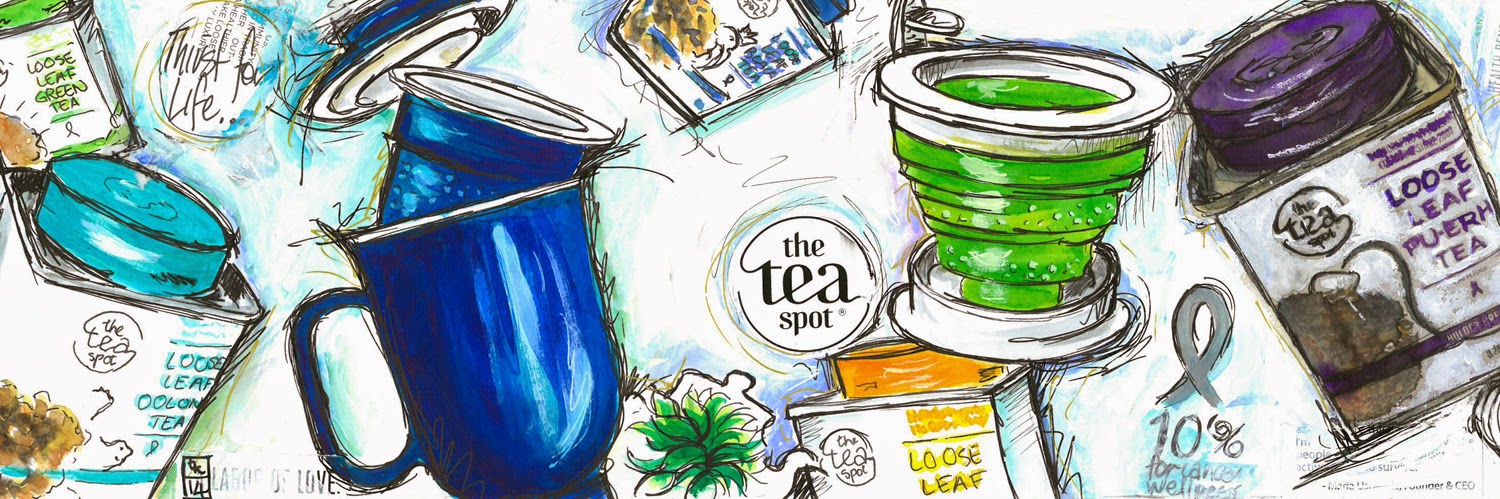
So here are the finished products... happy painting all...xx

and the Twitter header...